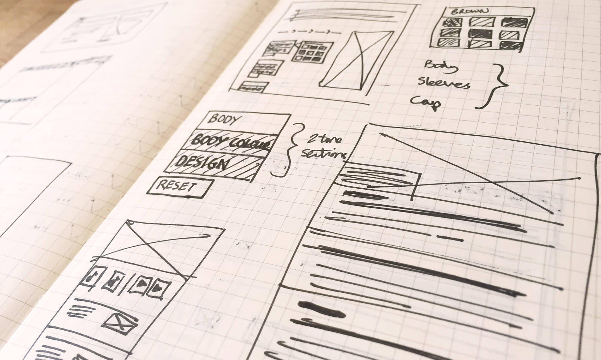
The process was kicked off with a top-to-bottom visual exploration of colour palettes, typography, use of imagery and iconography. Along with thorough sector research to explore trends and best practice within the horse racing industry. From this several concepts were designed and a route was subsequently chosen by the BHA to further develop.
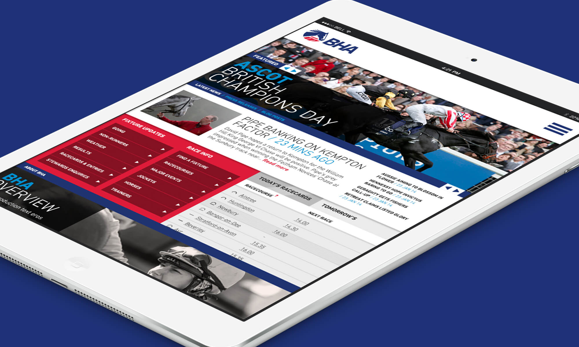
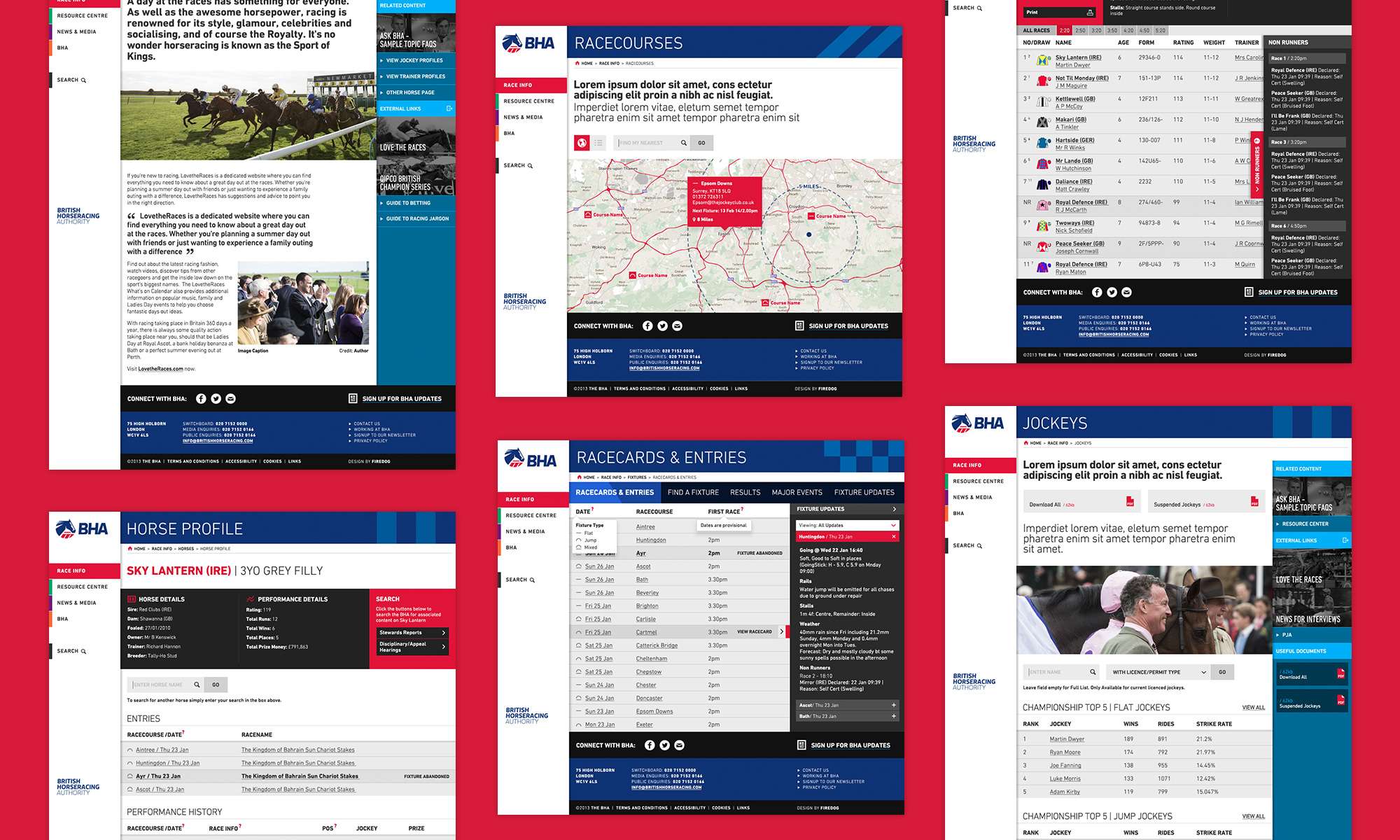
I worked alongside the digital director to design numerous page templates and push a consistent visual language across a variety of page templates. One of the biggest challenges on this project was reworking the way users navigate through the site. With such a wide variety of users — and each with their own unique skill-level — it was a tough challenge to cater for all use-cases.
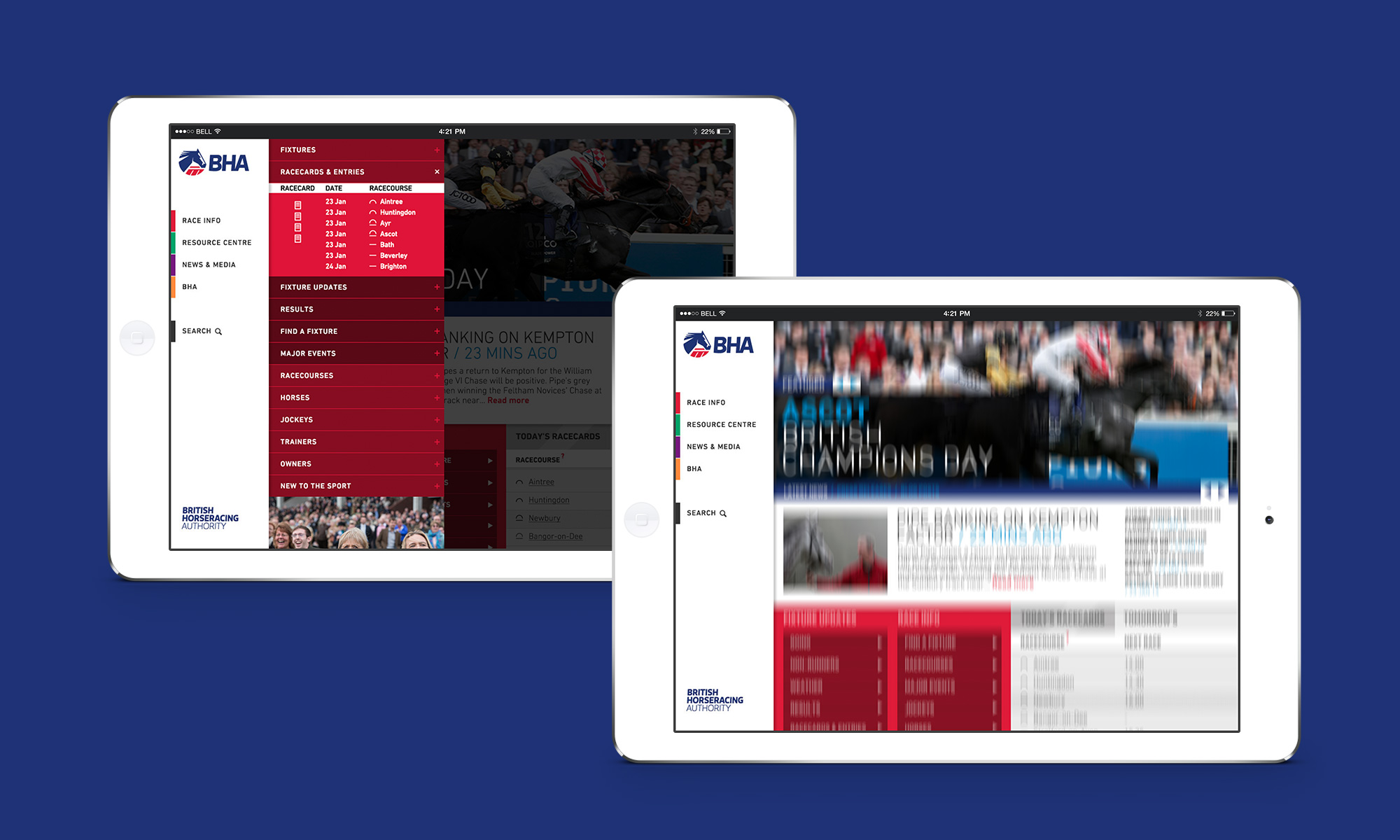
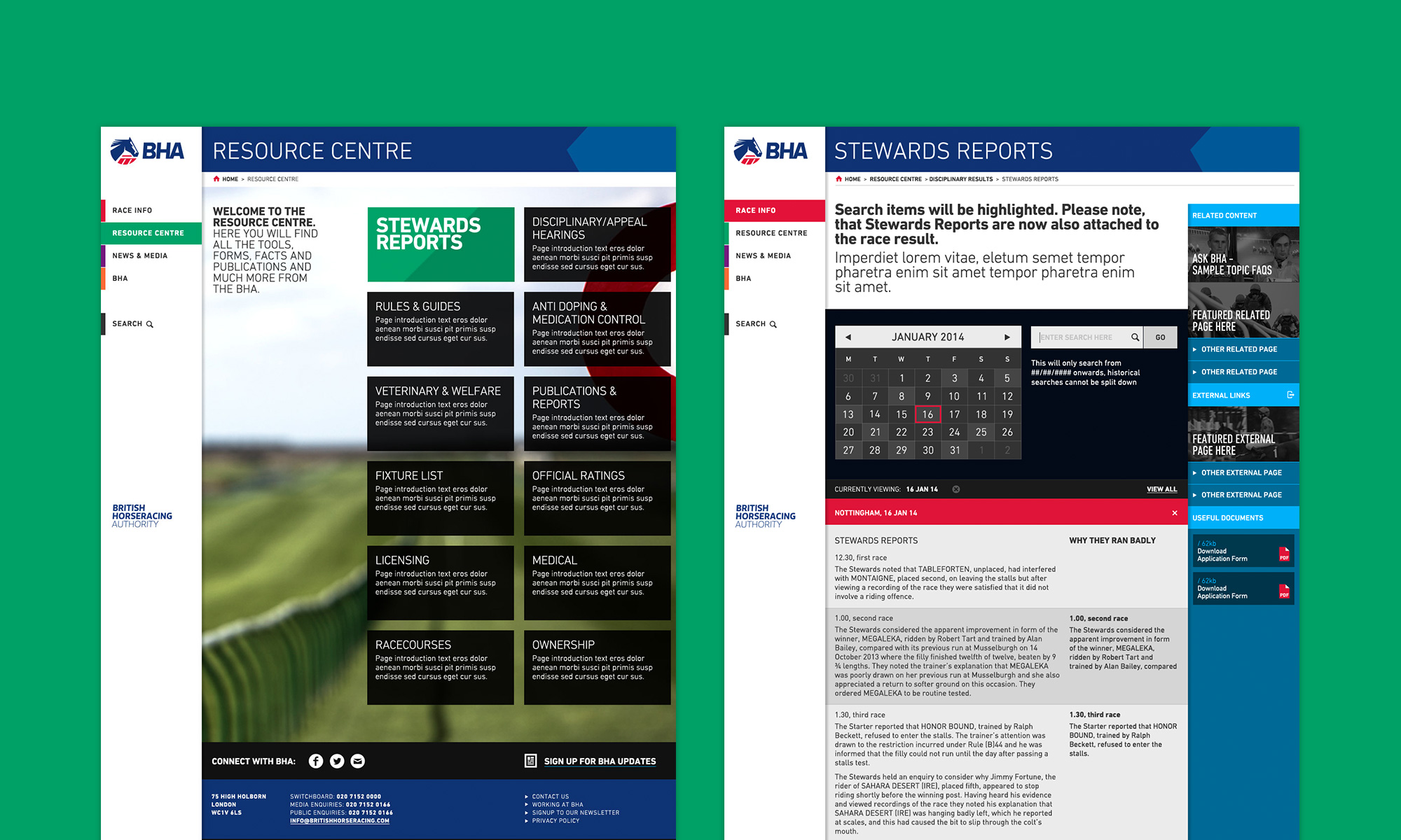
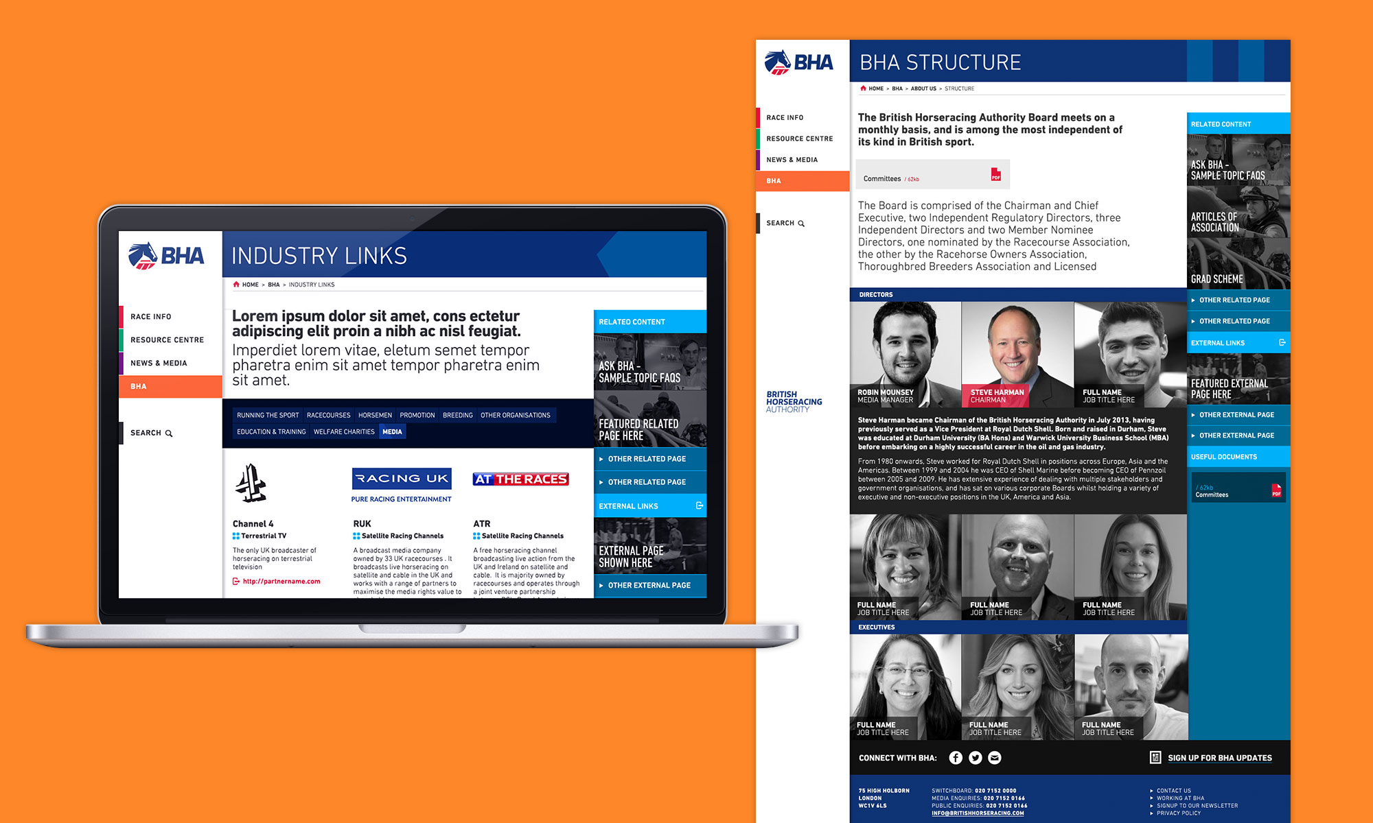
One way we overcame this was to split the site-architecture into five more regimented sections that provided a strong backbone to the website. Secondly we introduced an improved way to access more of this better-organised content.
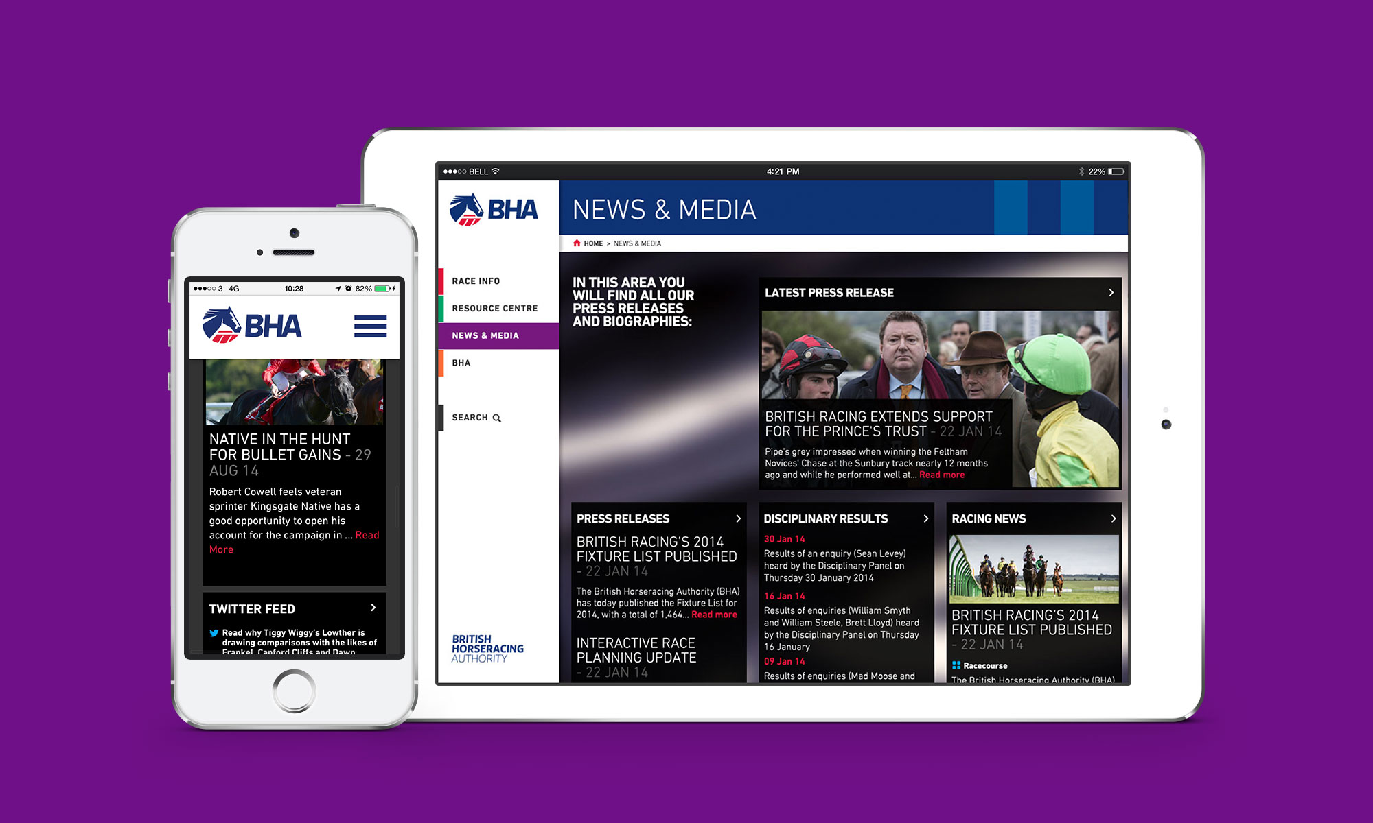
We brought in a fixed side navigation with direct access to the four key, colour-coded sections and search, which also allows you to access a second level of content on hover.
A photoshoot from two horse racing event locations gave access to a whole host of creative imagery for use throughout the website — resulting in a friendlier, personable and more approachable feel to the photos.