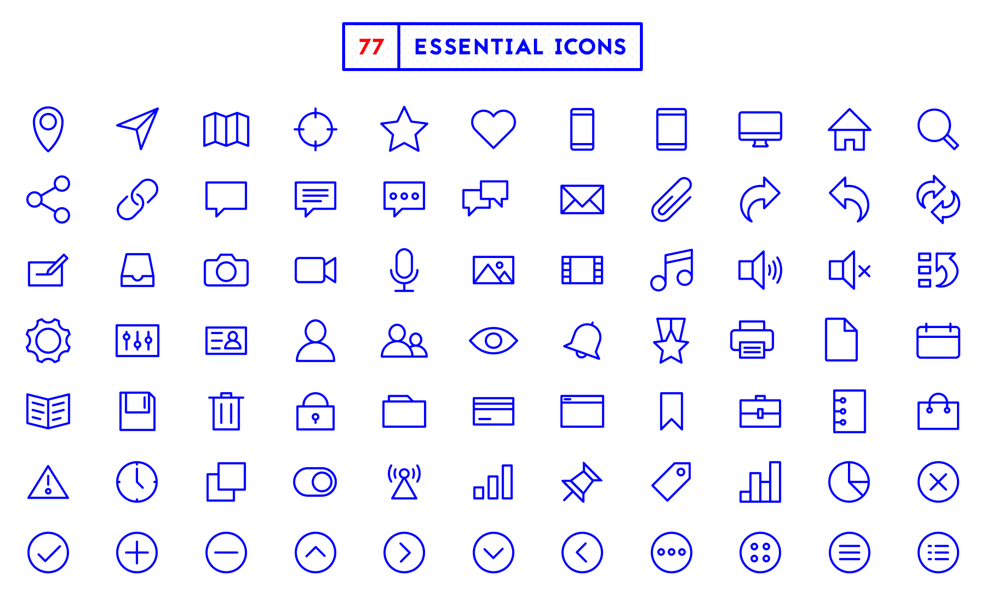
The process started with a stage of discovery. The first step was to come up with a list of icons to include. I noted my needs and looked through a range of interface designs. I ended up with a list of 50 or 60 essential icons.
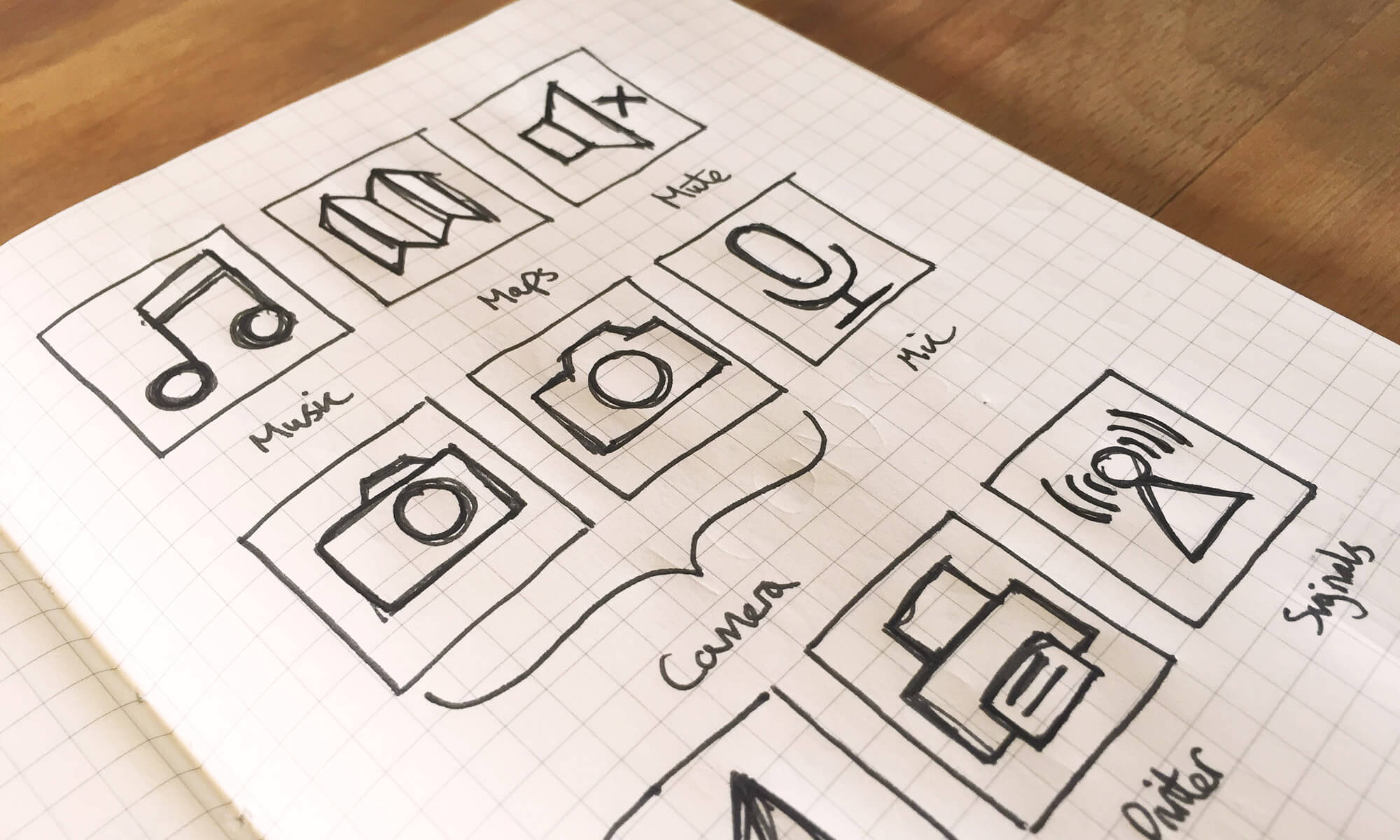
Sketching was important in my exploration process. A pen and paper allowed quick ideas. And you can quickly evaluate the success of different keywords. I tried to focus on the simplest form of each metaphor. Stripping out any unnecessary levels of detail. The main goal for each icon was clarity and user recognition.
I defined several rules and principles through the design process. This helped to define the style of the icons and keep each icon consistent with one another. This meant defining things like stroke weight, corner radius, size of gaps, terminal cap and stroke angles.
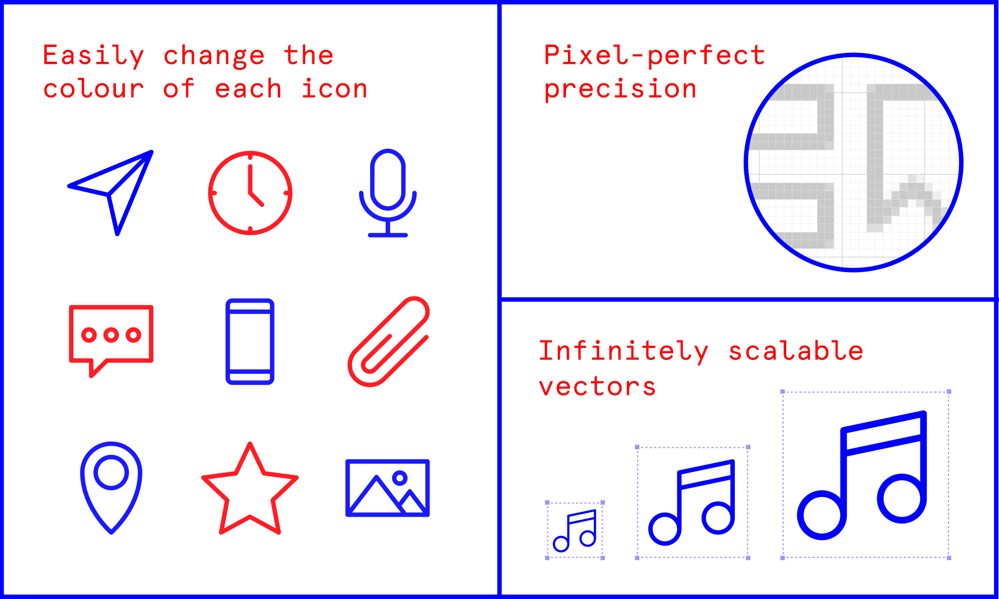
The icons were constructed on a 48x48 pixel grid. Making sure the horizontal and vertical strokes were always aligned to this grid. I designed and refined the icons in Illustrator — which gave the best flexibility for SVGs. Then I transferred each icon into Photoshop as a shape layer — with each point 100% on-pixel.
The icons went through many stages of refinement. With icon design, you can focus on the smallest levels of detail. I laboured over each pixel to ensure each icon was as identifiable as possible.


